Several UI improvements to the OA (Online Assessment) portal to make descriptions more discoverable, distinguish hidden questions visually, and clean up the question header area.
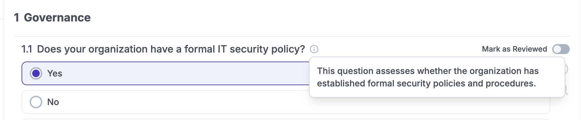
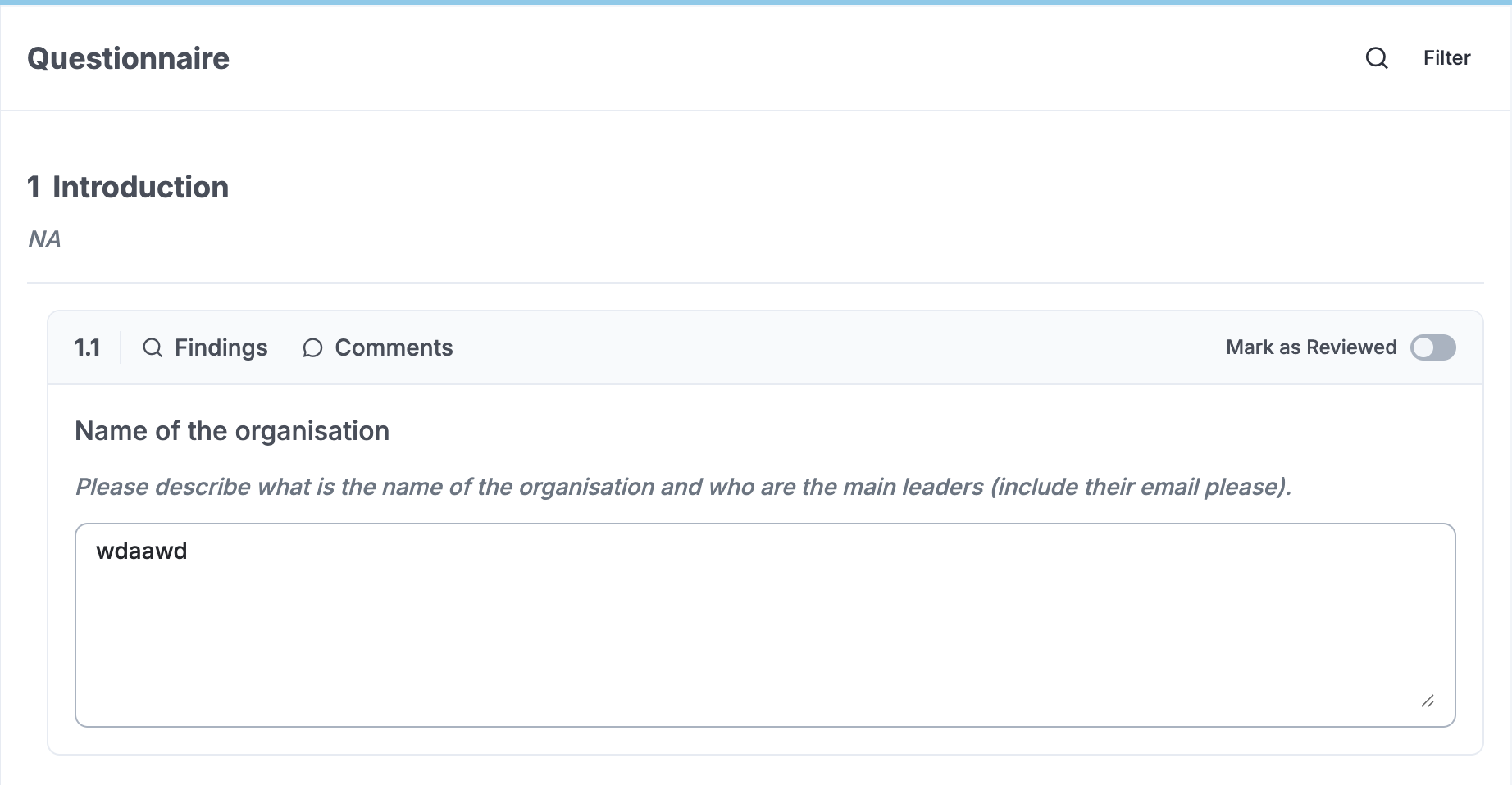
1. Always-visible helper text
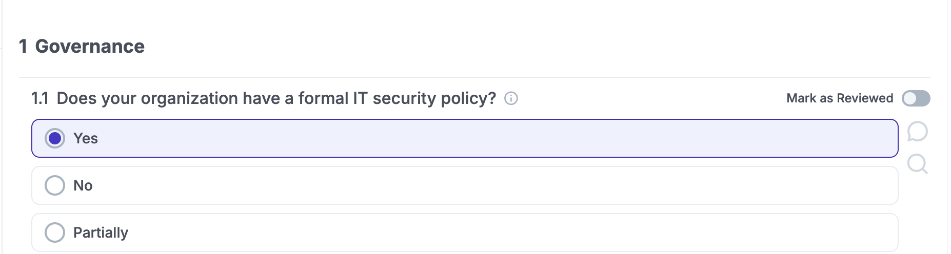
Current behaviour: Question description and chapter description are hidden behind a ⓘ icon. The user has to hover/click to discover them, which is not obvious.
Proposed change:
- Remove the
ⓘicon entirely. - Show the helper text always, in italic, directly below the question / chapter title.
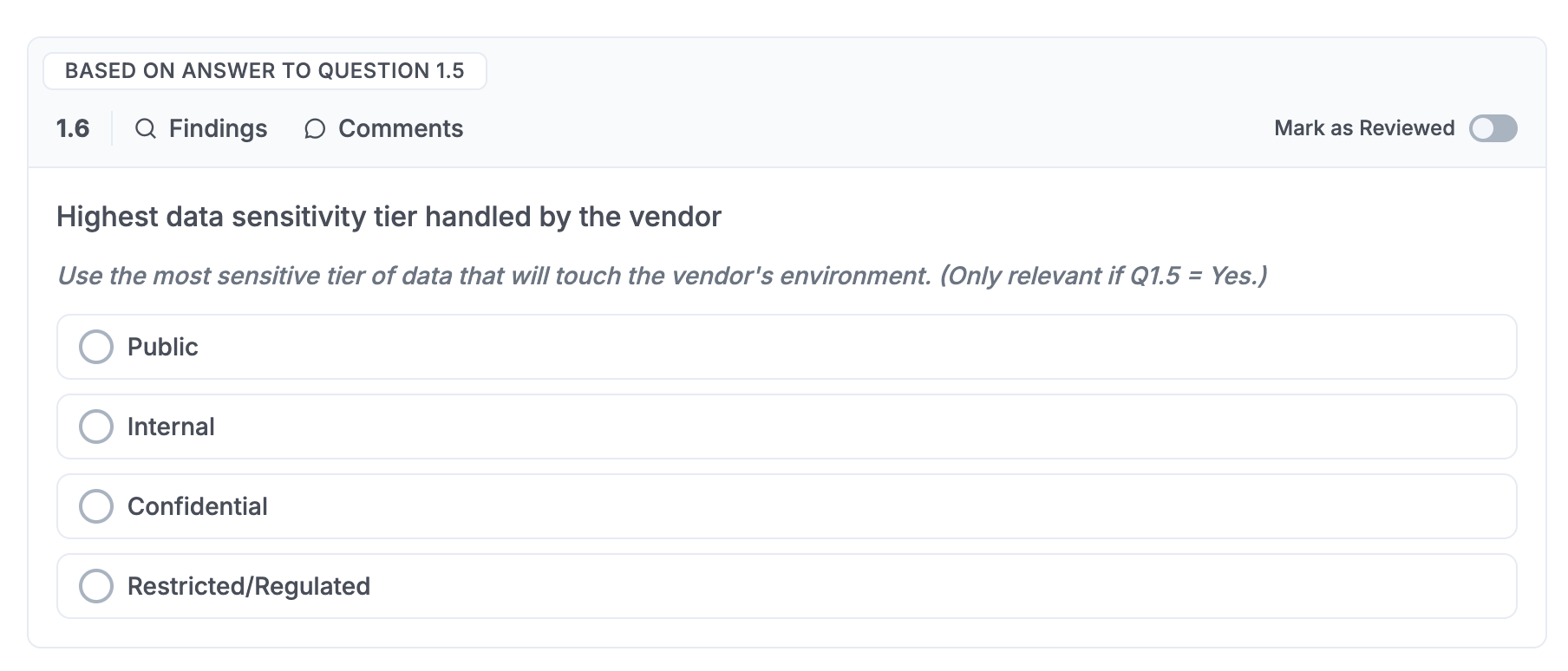
2. Hidden / conditional questions — visual differentiation
Current behaviour: Conditional follow-up questions (e.g. 4.2 appearing after answering 4.1) look identical to top-level questions. There’s no visual cue that they’re part of a different / nested order.
Proposed change:
- Indent hidden questions slightly to the right.
- Optionally add a thin vertical line on the left side to indicate the parent-child relationship.
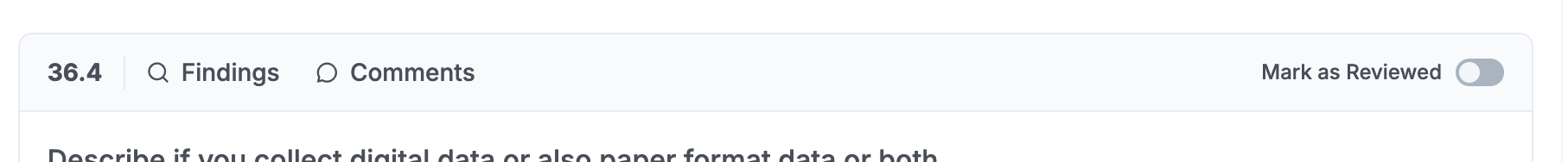
3. Question header redesign
Current behaviour: The question row mixes the number, question text and two small icons together.
Proposed change:
- Create a proper header zone for each question (number + question text as a distinct block, with clear typography).
- Reorganise/remove the icons so the header reads cleanly.