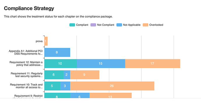
this chart shows the aimed strategy by the user … so what they want to achieve … their current situation is described on a chart above that shows the number of items based on their “status”
it would be good to have a third chart that shows the overlap in ebtween the desired status and the current status by simply adding a new bar … it will have many colours but well…is better than nothing. we’ll hold into this once we have dynamic status defined by the user (Feature - Custom Defined Role Names and Dynamic Status - #2 by eramba)
