would it be possible to have the items on the dashboard be clickable links, that alows you to drill down to the items or show a filtered page only showing those items?
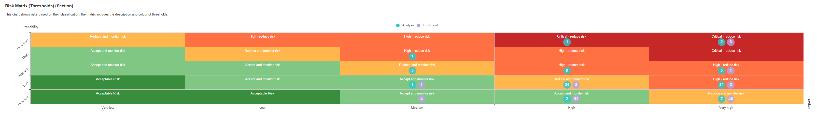
example - if i want to know which risks are placed as critical post-treatment, i click on the dashboard and eramba would take me to a filtered list showing the risks that are applicable to the selected criteria (e.g. risk score=45/threshold=Critical)
any graphical development is around 10 times more expensive than simple CRUD development (literally) … so we keep our graphical stuff to the bare minimum until Bill Gates calls us and donates a few millions to our bank accounts!
is nice what you suggest of course , but unfortunately there are many other things realting to reporting we need to achieve first (pivot tables, your own types of charts, etc)
Understandable, gotta get the biggest effect pr. dollar invested
I was just thinking that the filter used to create the rendering, could be imbedded as links in the representation, and that it would be “an easy target” - but put it on bottom of the list.
Hello,
As I understand eramba’s financial point of view, I definitelly agree with Jonas regarding the interrest of such a functionnality. In the filtering system, you cannot select all items with, for example, impact score 4 and probability score 5, you can only select items with Risk Score Analysis Equal 20… And in this case, it list you items with impact score 4 and probability score 5, but also items with probability score 4 and impact score 5 !!! And the same principle is also applicable to Risk Score Treatment.
Do you think it will be possible to adapt filters to take this kind of selections in account?
And in this case, it would be possible to link the dashboard to such requests that will give automatic list of items shown in Jona’s illustration in the initial post.
Thank you,
Alain.
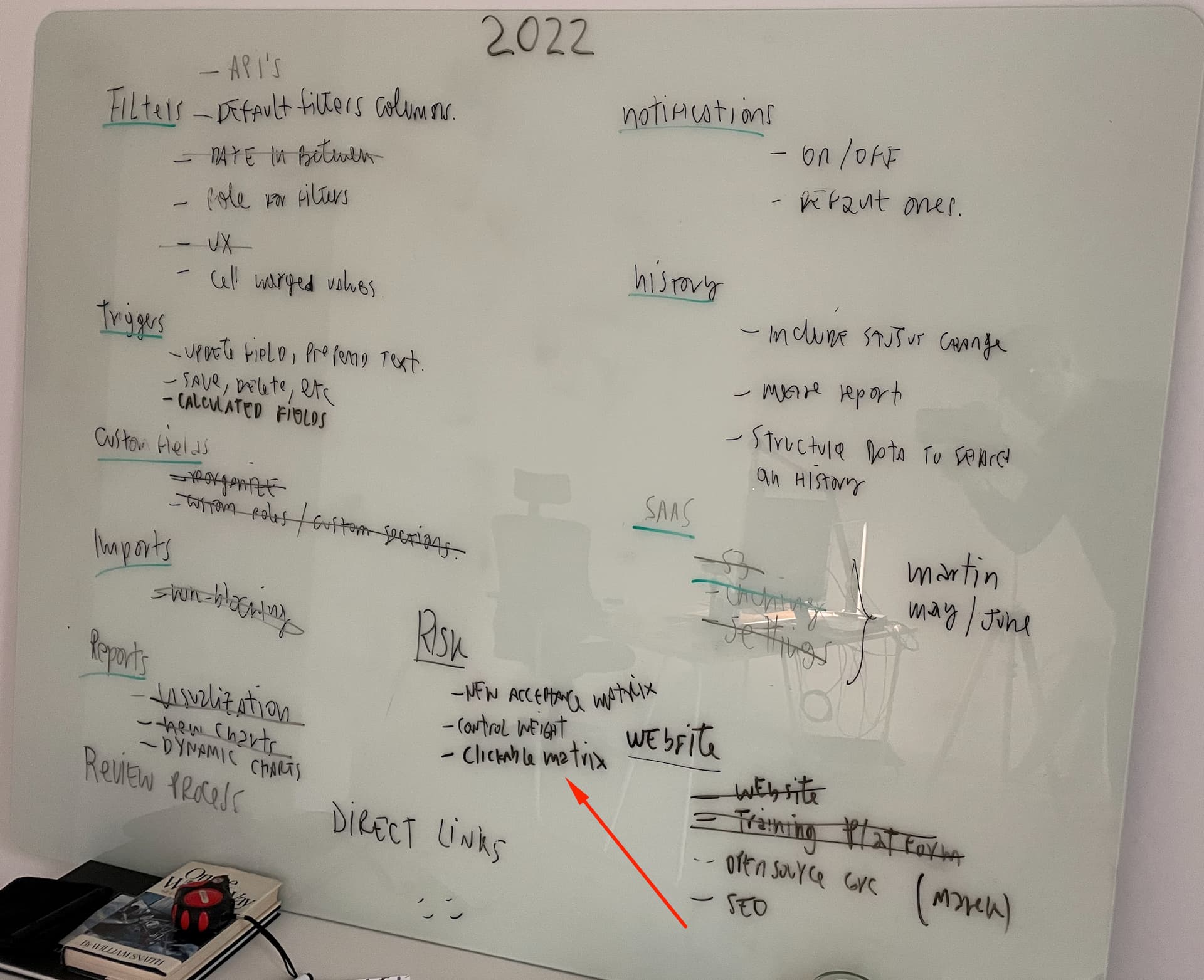
we are assembling a team for a new UI, it wont happen until next year tough.
Just curious, what are these prospective customer options and what is their price tag? My point is, how much are they willing to pay for a clickable matrix.
Hello, we’re currently migrating our risk register from Jira (with a specific risk management plugin), which allowed such drill downs, to Eramba. We’re really looking forward to this feature in the new UI. It will make all the difference during executive meetings where we need immediate drill down capability. Do you have any indicative timeframes for this? Thank you and keep up all the excellent work you’re doing!
Slightly late with this response, apologies . Clients would be willing to pay more if the UI was more intuitive. Your current price point blows all the competition out of the water. I review GRC workflow portals frequently in my role and nothing comes close to the feature set and customisability offered in Eramba. However, I am still not confident of taking Eramba proactively to our client base. We as a Managed Service Provider (and our clients) may not be your target audience, as such you can ignore me if that is the case.
With the “appified” culture we have today people are used to seeing things on the screen that look clickable and expect it to work a certain way. Graphs being clickable has been a feature in web application dashboards for a while now. I’ve been reviewing Cynomi recently, almost the same price point, less flexible but time to value is incredibly fast as a result, all heatmaps and charts are clickable and drill down to the underlying data.
Rows in a record set/table being selectable just by clicking on the row or even some of the column values being clickable that then open the record (for viewing or editing) are just intuitive things users expect. Its these little time saving intuitive elements that customers will pay more for because it becomes user-friendly and looks like it will save them time. Its also the type of thing they are looking for to take a leap in to a GRC portal vs sticking with spreadsheets. If the portal feels like it is going to make their work harder (despite all the additional benefits), they will stick with what they have.
The new UI has arrived and I see the graphs and heatmaps in the dashboard are still not clickable which is a shame, was really looking forward to that not being a blocker. The rows in a table used to be clickable directly in to “Edit” mode in the old UI, which was great, but now that has been made less intuitive and requiring more work to open a record (First World Problems).