We need a new dashboard from what we have today:
It has too much data (that not everyone might need) and is extremely expensive to calculate and it simply put does not scale well as databases become larger and larger. We will simplify the dashboard meaning some current features will be LOST.
General Features
The dashboard will use the same logic we have for reports:
- a user with sufficient privileges will create a report template with widgets
- that report will be shown on the landing page by default
In regards to the template builder:
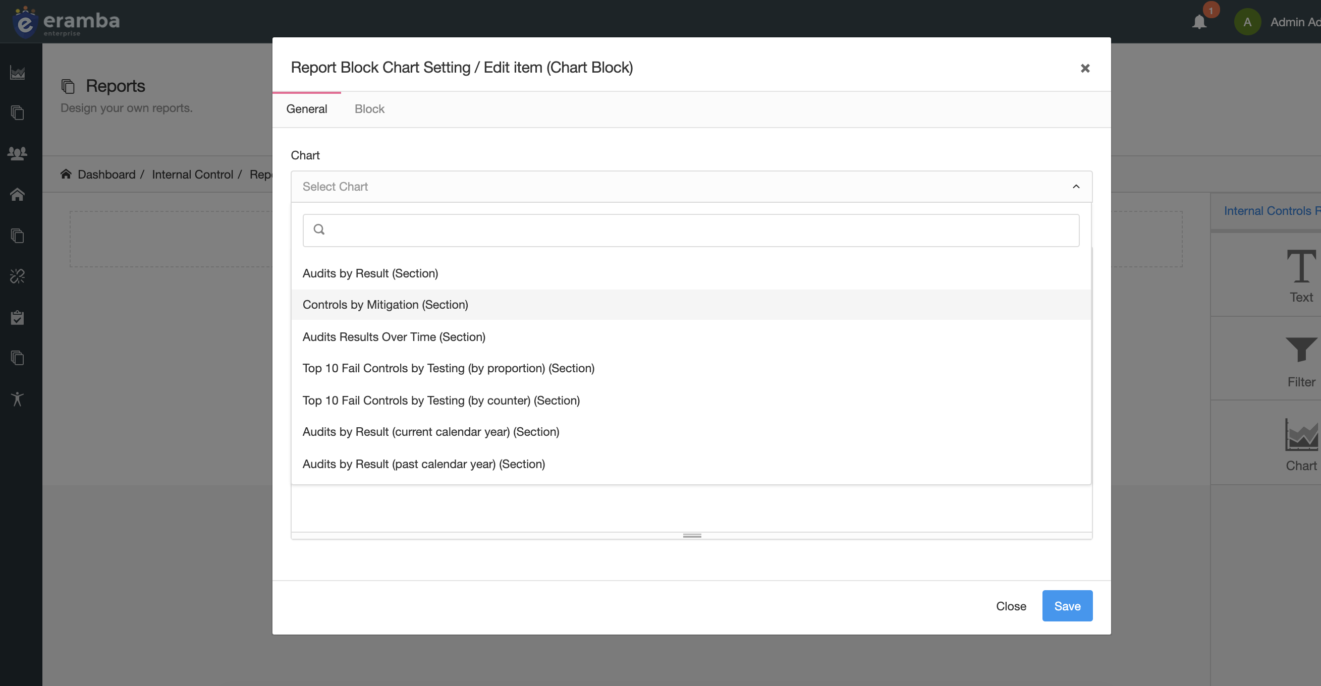
- there will be “Chart”, “Text”, “Filter” and a new one widget (which only be available in this builder, not no the sections report) called “Task List”
- report builder will include all existing SECTION charts and filters from all sections
- the “Task List” widget will show data that relates to the user, it means visualisation will apply
- we will include a few NEW charts that need to show items based on visualisations (based on who logs in) , this charts will only apply to the dashboard not to the sections.
- filter widgets only on the dashboard report , will all have an option where the admin that creates the template decides if they want to enable visualisations or not (by default disabled)
Since this is a big visual change, we’ll let the user decide if:
- they want to load the new dashboard
- they want to load the OLD dashboard (the current user, admin and calendar)
The new dashboard uses the whole screen, no tabs are shown at all.
Dashboard Report Builder
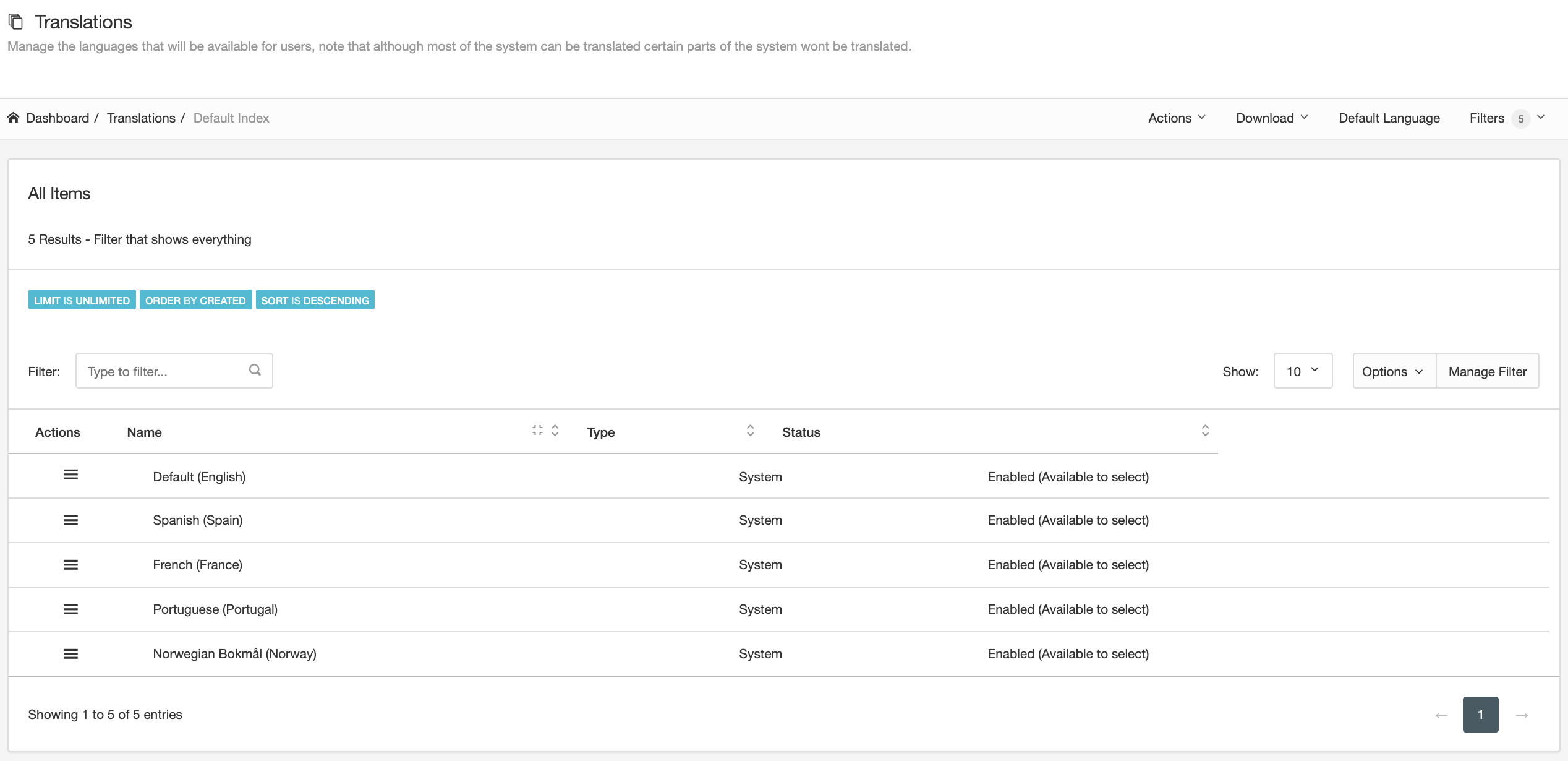
The dashboard builder will be configured from System / Settings / Localisation with a feature called “Dashboard Template” , when the user clicks there we show a page we will use the same setup as “Languages”:
-
There will be a list of pre-created system reports that cant be deleted or edited
-
The user can create “New” reports (Actions / New Dashboard Report)
-
The user can delete existing, non-system reports (only if they are not active)
-
The user can “Visualise” a report (to see how it looks before is activated)
-
The user can “Set as Default” an existing dashboard report (this means it is what users see when they log in)
-
We’ll have a row on that list which will be called “Legacy Dashboards” which is what we have today and will be by default what is enabled (in this way we let users to keep using the dashboards we have now for a few months)
-
A toggle that enables the new dashboard (otherwise the old is enabled)
-
If the step before is enabled the user gets a drop down with all dashboard report templates that have been already created (there will always be a system dashboard made by us)
when something is selected the user can 1/ delete the template 2/ select it as
There is another button for “Create new Dashboard Template” , this basically loads the template builder as we have it now.
Widgets Types
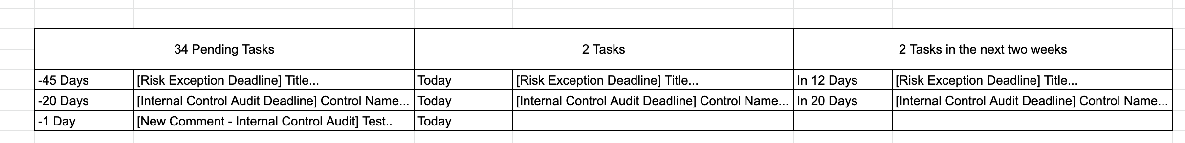
Task List Widget
This is a new widget which is only shown in this dashboard page. It shows in three columns tasks that were triggered by notifications, the columns refer to “Past, Current and Future”.
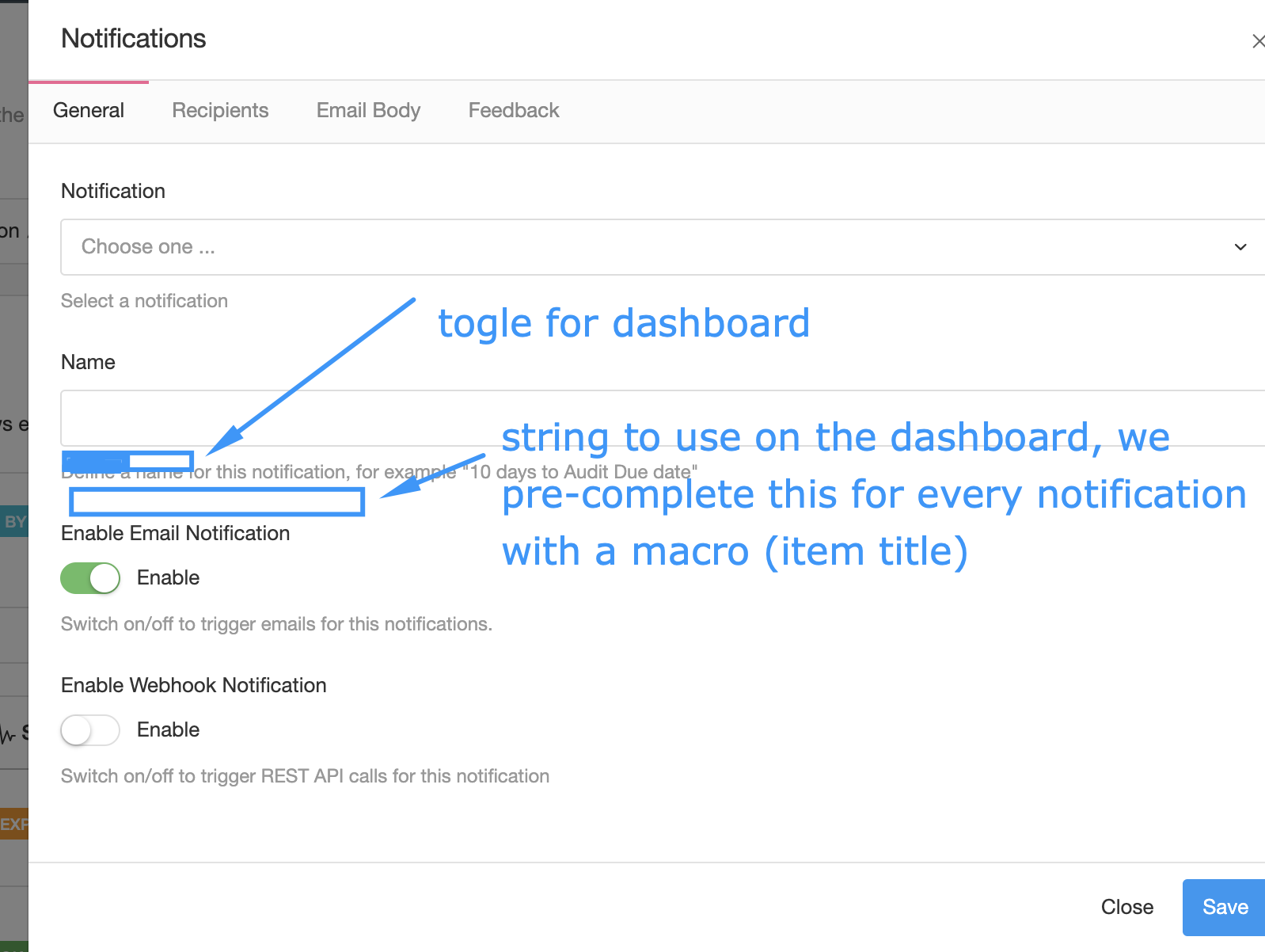
How is the notification configured?
We need to expand notifications to include an additional widget, when enabled a text field is shown below (there is where the user defines how this will be displayed on the task list). That textfield can use macros to make the label that will show on the task more descriptive.
The user can have that toggle enabled and rest/email disabled. in that case no tab is shown as rest and email settings are not needed.
Example: Imagine I have three warning notifications on policy section: -1, -7 and +1. Whenever they trigger we pick up the “Policy Owner” and “Reviewer” (the custom roles for that section) and show on their task lists ALONE.
What is shown on the tasks?
The task list shows the warning notification as a label in one of the three “panels” depending on the date (future, past or current). Since we don’t have notifications for more than -30 or +30 days, panels show that much data in the past and future.
The label on the panel has the following format: (Today|In %s Days|%s Days ago) $NotificationName: $TasksLabelName
Where $NotificationName is the name of the notification (title) and $TasksLabelName is the textfield the user can define on the notification (which might include macros)
What can the user do with the labels on the Task panel?
By clicking them the user has two options:
- Mark as read (this changes the colour of the label indicating that it has been read)
- Go to Item (this open a new tab that takes you to the item)
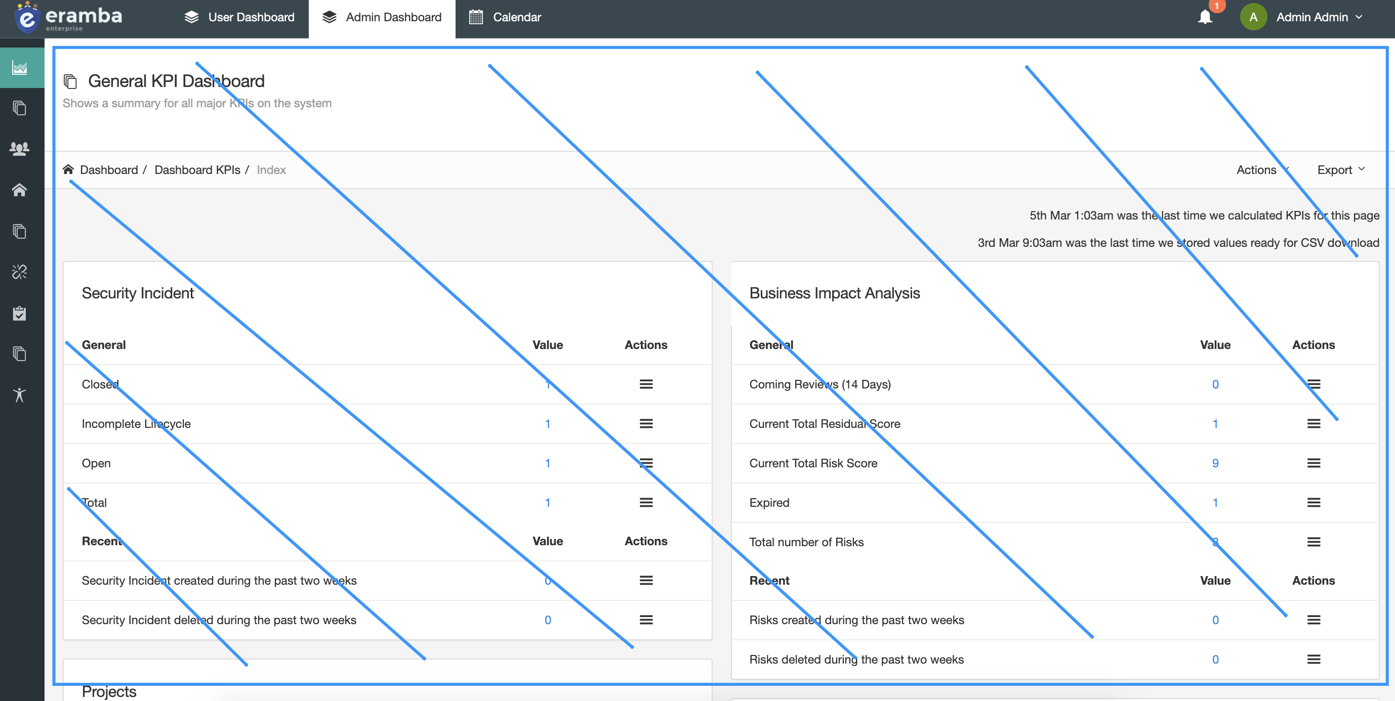
Chart Widgets
The idea here is that the user can choose from a list of charts what they want to display. The logic is the same as section report, but there are two differences:
-
Some NEW (not existing ones) charts will have VISUALISATION enabled, this means FOR EXAMPLE that if we show a chart about Internal Controls grouped by status, then you need to look for the logged in user what items are assigned to them (using visualisation) and based on that build the chart.
- Some charts (probably only the new visualisation ones) will be clickable, when you click on the number it takes you to the section with a filter.
To this list, simply append the section name in the beginning [Control Catalogue / Internal Controls] [Visualisation (Enabled|Disabled)] $chartname
The only charts that will have visualisation and clicks enabled will be a new chart we need to create, is the same chart for every section. It shows items on the section grouped by dynamic status (as percentage), over time. This means a chart over time (time periodicity should be 1 value / week over 12 months maximum … so maximum 54 or something data sets per dynamic status per section). We dont need to store older values so rotate data as needed.
Note: if a user has zero items on its name for a given section then don’t waste time calculating anything, most users dont have anything associated in eramba and therefore we could spare a lot of cpu there. Is important to test this with a database that has 4000 users. Also since the dashboard is a template for all users (except the visualisation) i’m pretty sure we can keep it on the cache and calculate it say once every hour. I don’t think we need real time data.
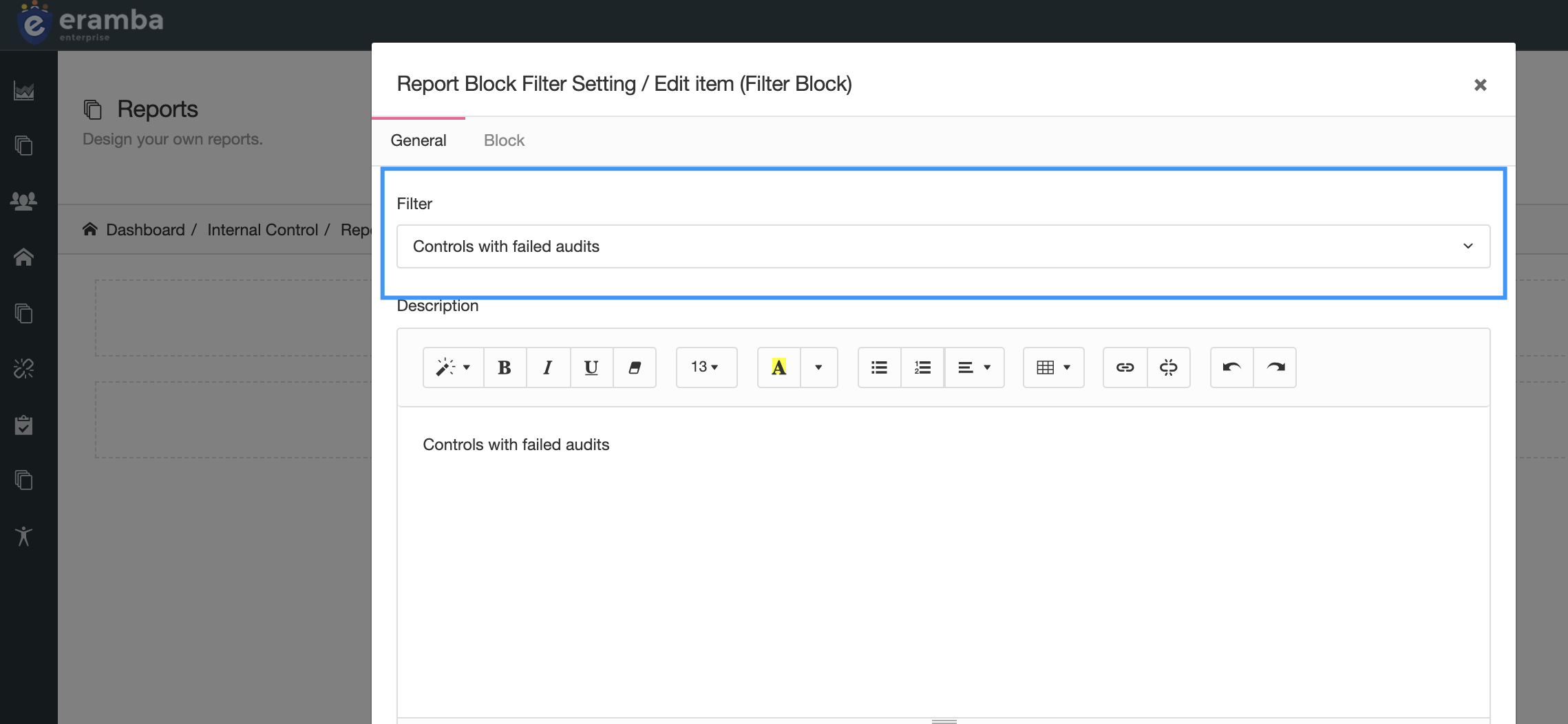
Filter Widgets
This work the same way as we have today, we list all filters from all sections (follow the same naming convention as the charts) , the addition is that on this dashboard report builder (not on every section) filters have two additional settings:
- Visualisation Enabled (if enabled, visualisation are enabled)
- Counters / List of Items (if enabled, instead of the list of items on the filter you show the counter)
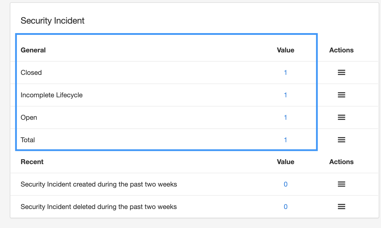
The counter option needs to show data like this:
The number of items is a clickable event, meaning that clicking on the number takes you to the section. You can calculate this numbers every night as part of the daily cron.
Service Request Widgets
LATER , NOT NOW
- user can build a custom form to collect data from users? reporting incidents, etc
- user has a quick add button to create risks, incidents, etc … this will be handled by workflows anyway
Note: this feature will come later as an upgrade to the dashboards
Github: https://github.com/eramba/eramba_v2/issues/2449