This post is on-going and will be updated as we defined the concept in more detail. This post is closed for comments.
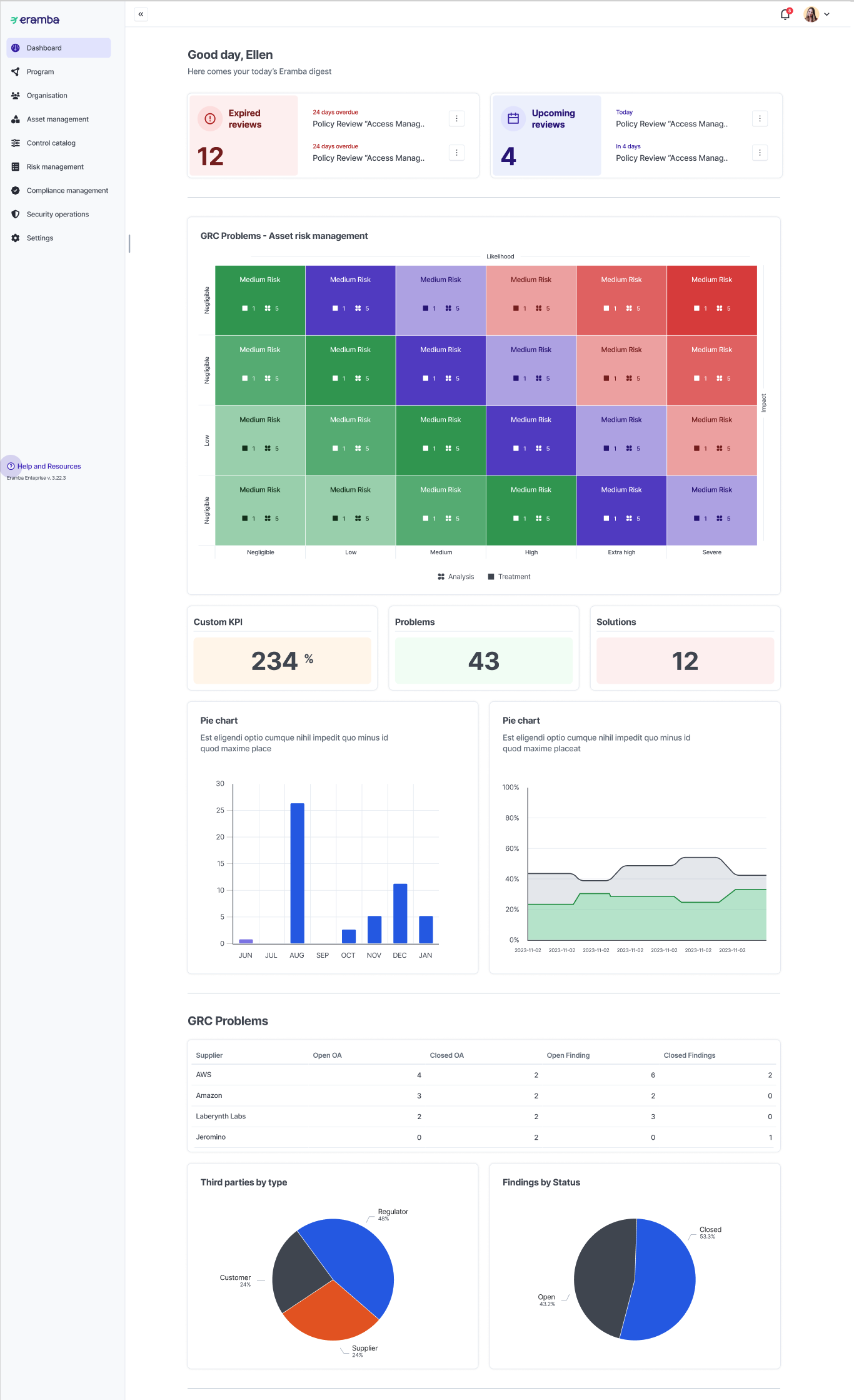
New reporting features:
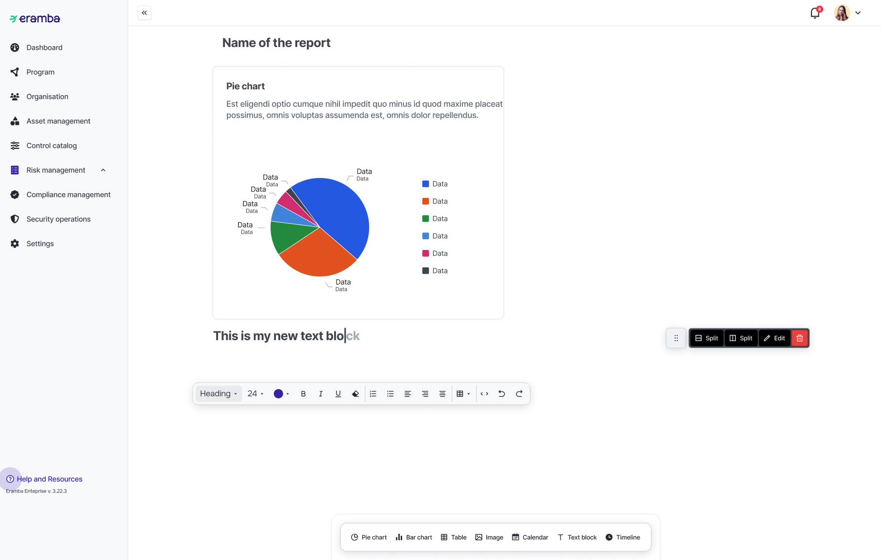
- Widget options: text, media, charts, counters, calendar, API Dashboard & pivot tables, date
- Configurable “Charts”: pie, bar, stacked bar and line chart
- Click “chart” and display input data filtered by that clicked column
- Allow users to show different dashboards based on the user group. If a user has more than more group assigned, what we do?
- Allow people to email the landing dashboard as a regular email report
- When charts, pivots, etc are used we need a way to “Reload” the widget so as the user changes settings it can preview how the widget looks
Date
Adds a date timestmap to the report
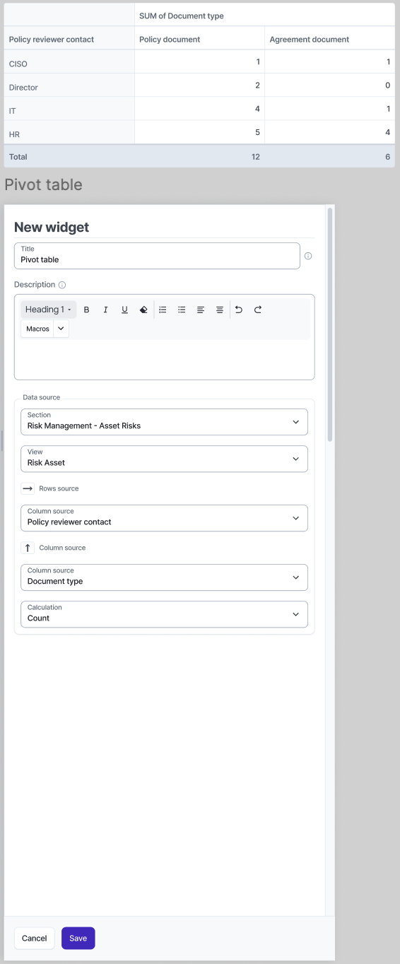
Pivot Table
The user should be able to display a simple pivot table on their reports. For example the user could summarize filter data with a pivot as shown below:
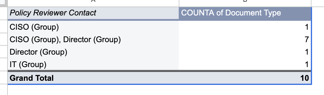
The process used to create a pivot table is as follow:
- Select a module
- Filter data (we use the same logic on the new widget for charts)
- Select a single column from the filter to use as rows inside the pivot
- Select a single column from the filter to use as columns inside the pivot (optional)
- Apply a “Calculation” to the data (sum, avg, count, counta, etc)
Note: some columns have multiple values and these values if used as “rows” or “columns” inside the pivot, they must be broken down as multiple rows or columns to avoid the issue shown below:

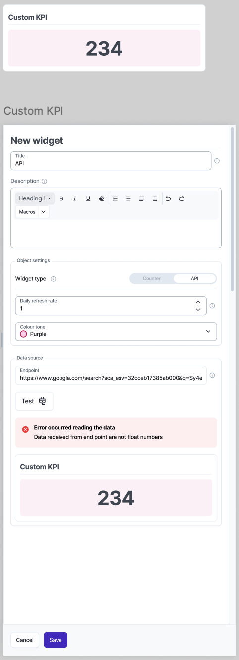
API Widget
The api widget is used so customers can send data to eramba using REST and this data is shown on the reports in the form of “counters” (later this can be charts over time, etc). This produces the same output as the “Counter” widget but it relies on data from external systems.
To create this widget the user:
- The user sets the name of the widget (which is displayed on the counter)
- The user defines how many times per day eramba will accept new values (once is default), we need a limit in case someone brute force attacks this feature.
- eramba shows an endpoint (with single auth) for the user to push data to eramba (data must be float numbers)
Note: we store this values with the typical created and updated columns as we might then upgrade this to use charts over time as well, not just counters.
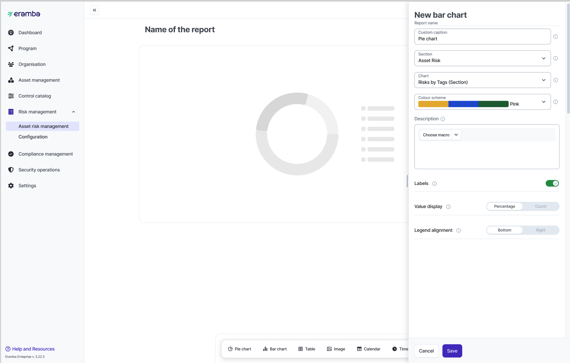
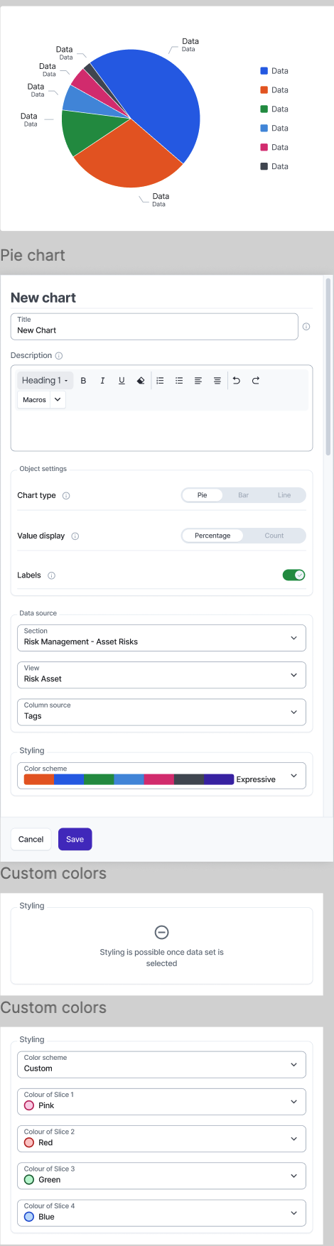
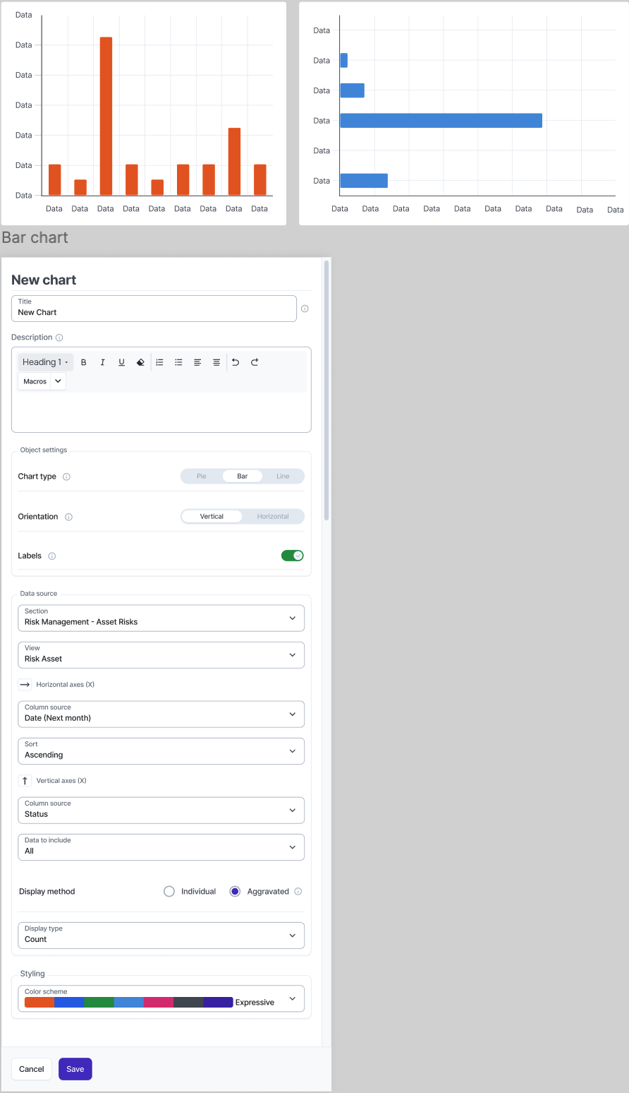
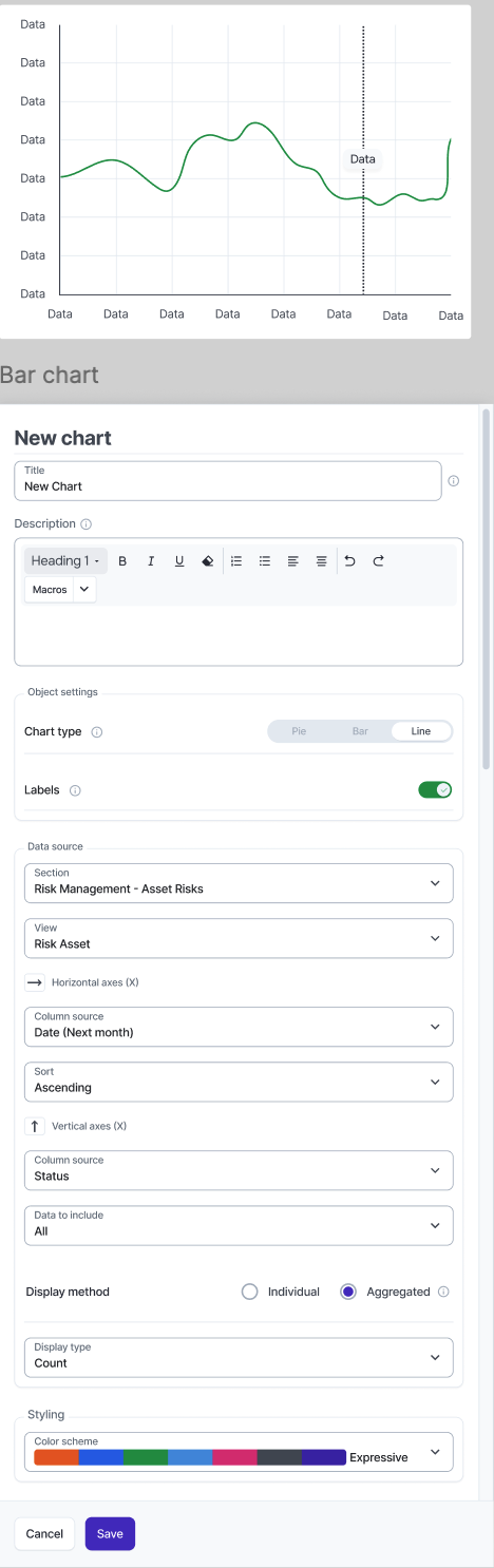
Chart Widget
It will allow the user to create a chart by following these steps:
- The user selects a module module (policy, controls, etc)
- Using filter options, the user needs to select what data from that module they wish to use on the chart. I considered using existing filters, but then we could run into trouble if they modify or delete that filter.
- The user selects the type of chart: Pie, Bar, Stacked Bar (yes of course the Bar chart could have two variables: stacked or no, vertical or no)
- Depending on the type of chart selected, the user needs to select one or more columns from the filter they pre-selected to display on the chart, some charts require one column and some require two or more.
- One column: single bar, line
- Two or more: pie chart, bar, stacked bar, line
- The user now should be able to visualise the chart and we should offer the user to “re-load” the chart every time they choose a different column
- Depending on the type of chart selected, the user should be offered some settings:
- Pie: Colours (select your colour for each data value), Labels (if you want to display labels or not)
- Bar: Value (Counter, Max, Min, Average -note this only applies if the column selected is numeric), Orientation (horizontal or vertical), Colours (select your colour for each data value), Labels (if you want to display labels or not)
- Stacked Bar: Value (Counter, Max, Min, Average -note this only applies if the column selected is numeric), Orientation (horizontal or vertical), Colours (select your colour for each data value), Labels (if you want to display labels or not)
- Line: Value (Counter, Max, Min, Average -note this only applies if the column selected is numeric),Timeline (which column from the filter you wish to use for dates on the X axe in which case eramba will group by date the previously selected columns), Colours (select your line, the colour, type of line, etc), Labels (if you want to display labels or not)
Issues to consider: