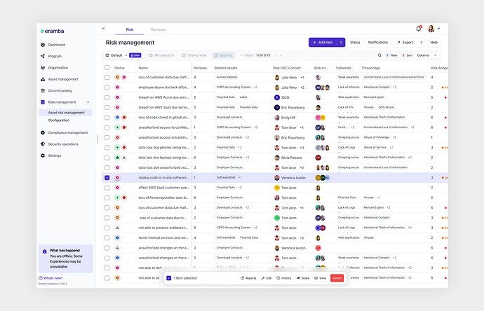
Comprehensive guide through the most significant UI changes you should know about.
As we approach the final stages of Phase 2 for the new user interface, which includes the development of a new index page, we would like to provide a more detailed overview of this functionality and outline the upcoming changes.
Collapsable navigation
The first thing you may notice is a change in the menu’s appearance and a slight update of it’s functionality. The most notable change is the ability to hide the whole left menu panel to maximize the working window.
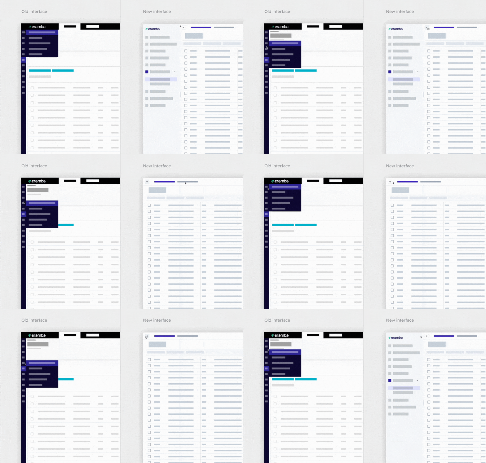
When it comes to the rest of the menu navigation items such as Assets, Reviews, Audits or Maintenance they remain firmly in the same place. The only change here is the visual update matching the rest of the new UI.
Filters are becoming Views
In our previous version of Eramba, you could view items in a table layout and adjust the scope of results by using filters (for example, showing only expired reviews). The new update will still keep this logic with one little change. Now we will call filters simply, views. These views will be also moved from a menu list to a horizontal layout above the table and will resemble tabs. This will save you time when browsing through different content as you don’t need to open the list anymore. To adjust the scope of each view you can use the actual filter feature that will allow you to define conditions to narrow down the data output.
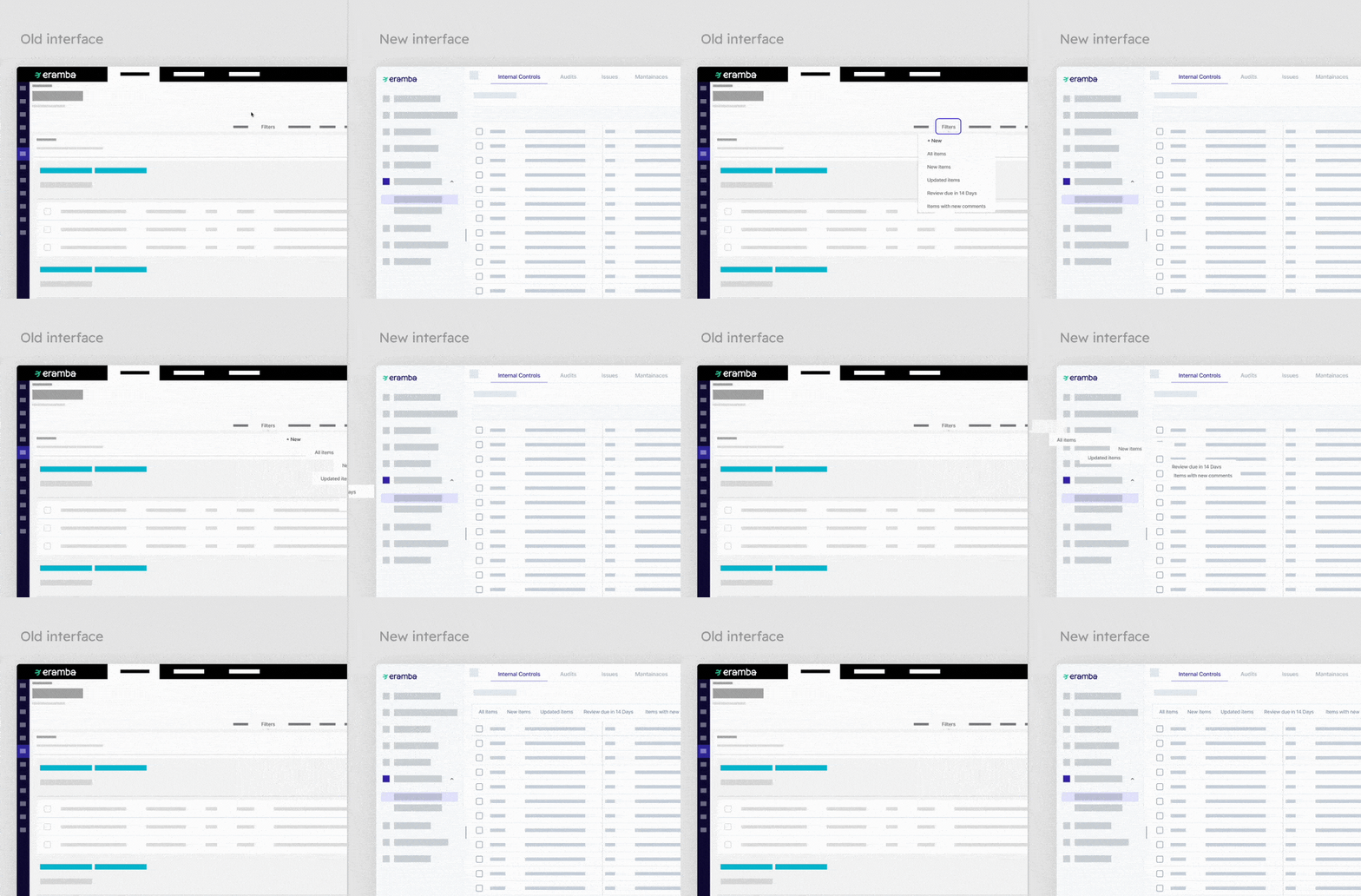
There are however few important notes to remember when talking about views. There are a few types of views and they work slightly differently.
Default view - You can designate one of the views as your default, which means you will automatically be directed to this view each time you access the module. The default view setting is user-specific, allowing each user to select a different view as their default.
System views - These are pre-set system views that cannot be edited. However, you have the option to create a duplicate of any system view and customize it according to your needs.
Pinned view - Naturally, not all the views will fit into the horizontal layout. Some of them will need to be stored under More dropdown menu. However, you can prioritise the views by pinning them, which will give them the priority to stay in the view tab container.
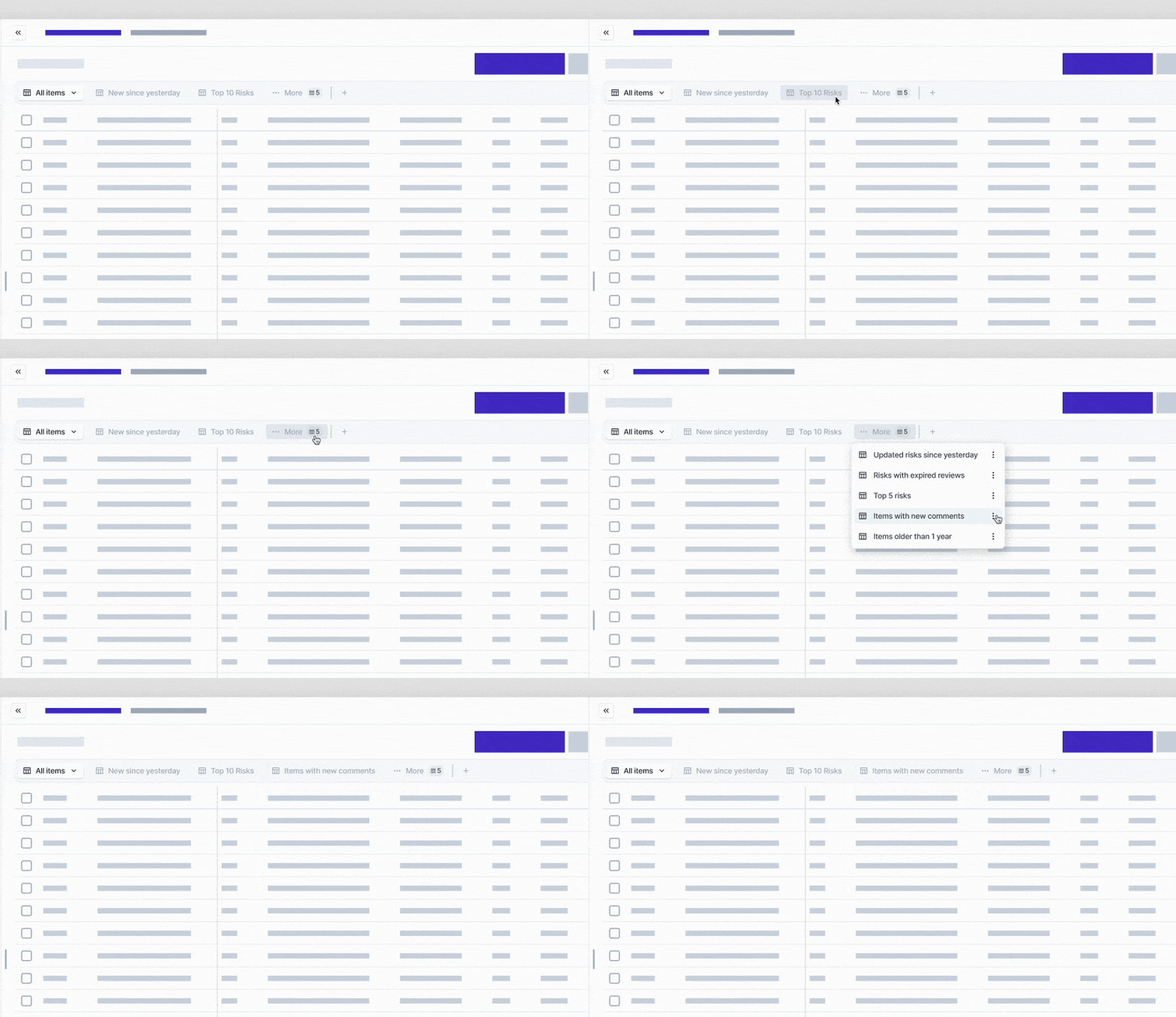
FAQ: What will happen to my current filters?
Your current filters will simply become views - so you won’t lose anything. However, we strongly recommend reviewing your filters and removing any that are no longer relevant or in use. This must be done for each user individually as filters are specific to each user.
View creation and sharing
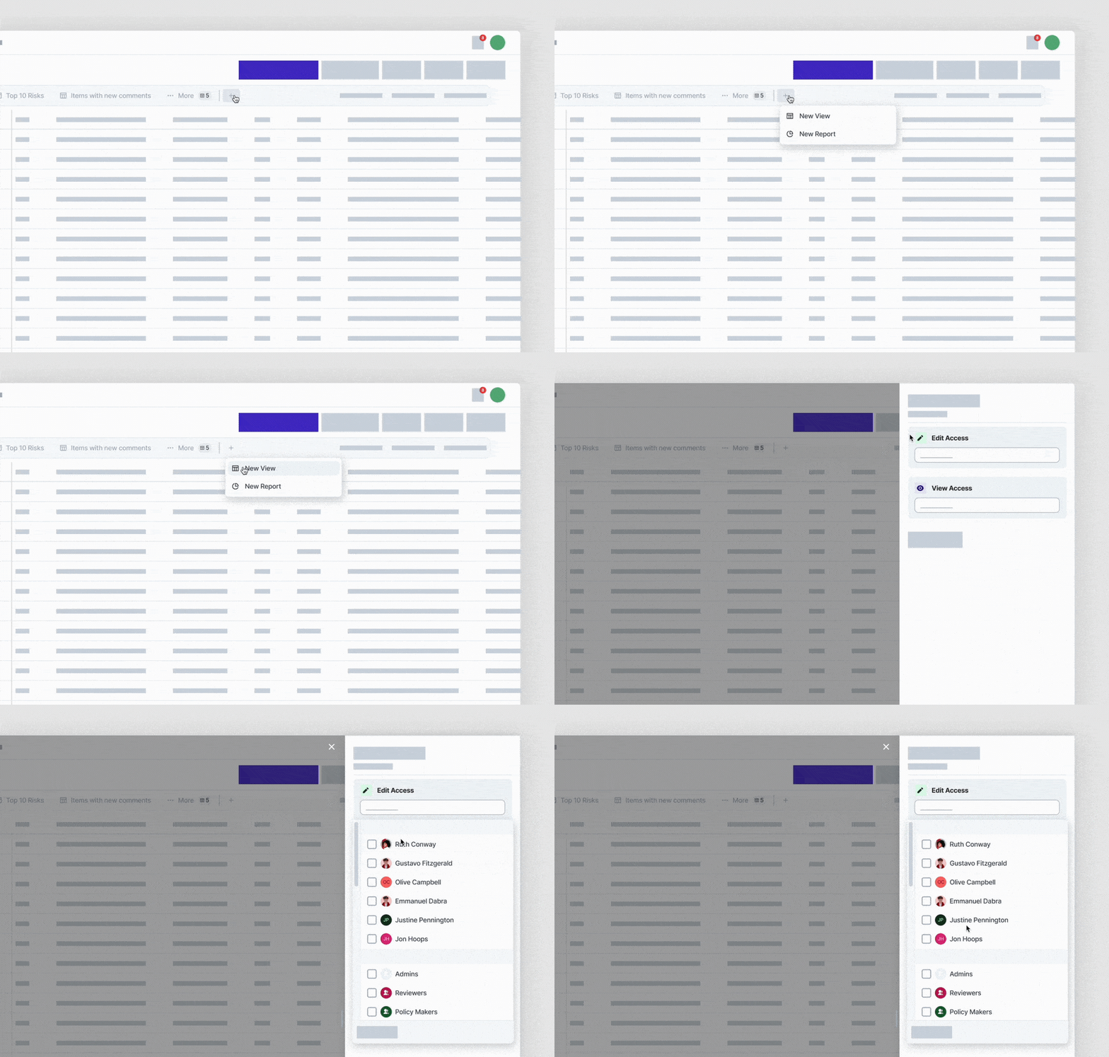
The creation of views can be done in our new interface in two different ways. You can either duplicate some of the existing views or simply create a new one from scratch via the ”+” icon button up top. Whichever way you choose, you will have the option to share this view with your teammates and define the level of control they possess over this view. In this case, there are 2 self-explanatory options, Read-only and Edit rights. This permission can be defined right upon creation of view or at any given moment. Setting the collaboration into the centre of your workflow.
Section Reports are merging with Views
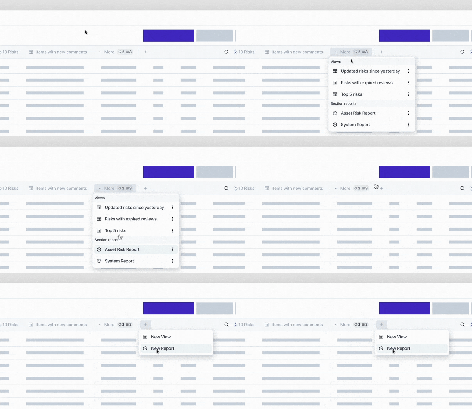
One of the essential features of Eramba is its ability to create reports, to digest data in a predefined manner, fitted to a specific use case. Creating and viewing section reports used to be accessible via the action button from the section above the table. This has changed now. The new UI merges Report functionality together with views. This means that you can access Section reports from a tab view menu and create them by clicking the + button.
Decluttering section Menu
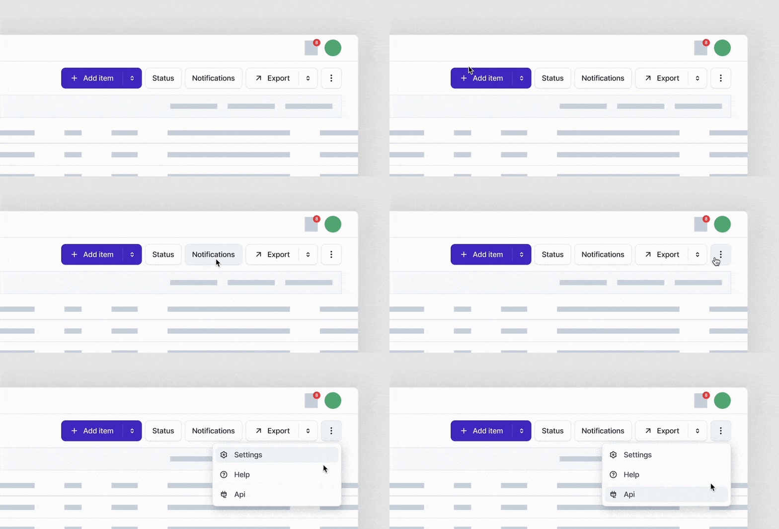
Small changes are to be made to a section menu which is now focusing on highlighting the most used actions while keeping single-time used and less frequent actions out of sight. Namely, Item addition, Status configuration, Notification configuration and Content export will remain in same familiar spot. Everything else that you might need for your workflow will find it’s new place under the ellipsis (three dots) action button.
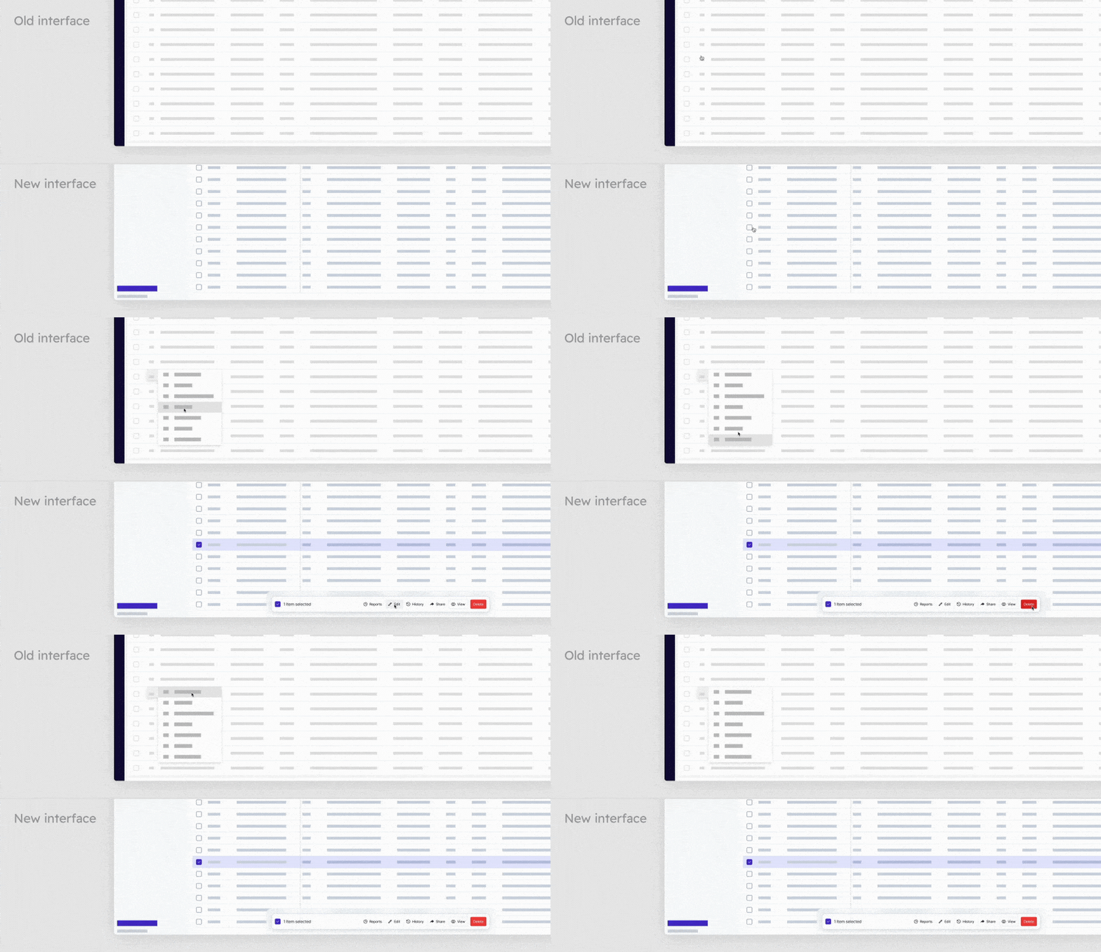
Managing the item(s)
The way how you handle individual items from the table gets refresh too. All the actions of item management such as edits, sharing or deleting are moved into a container that will pop up once you select an item. The same element is used for bulk edits as well. Simply choosing more then 1 item will update the options that are available as far as bulk edit goes.
