Our charts are static, you can not change the colour or their calculation method. We will expand them in June (add some more charts ,fix some that dont make sense, enable visualisations on all of them, etc) but we want to explore the idea of a widget for reports what allows you to make your own charts.
We will start with pie charts as they are simpler, the idea is you can make a pie chart based on a filter you choose … the pie chart will then require the following attributes:
1/ the filter you want to use and from where eramba will extract data. eramba will need to run the filter every time the chart is built or updated to get the latest value
2/ the columns of the filter you want to use for this pie chart. a column in eramba is made of a header title (the column name) that can contain:
- numbers
- strings (policies name, controls ,etc … note that you can make a filter count things instead of name them by string)
3/ based on what you select in #2 you have different options, because the pie chart needs two things: a variable (label in spreadsheets) and a number (the number might be converted to percentages)
If you select ONE column:
- whatever is in the column become the label
- the counter can be the items grouped by
- chart settings: the number is expressed as counter or percentage
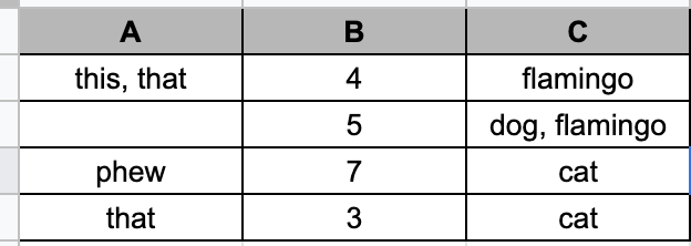
For the table below:
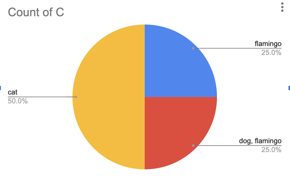
If i pie chart column C i get:
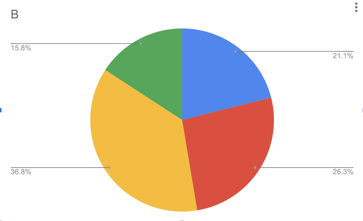
If i pie chart column B i get:
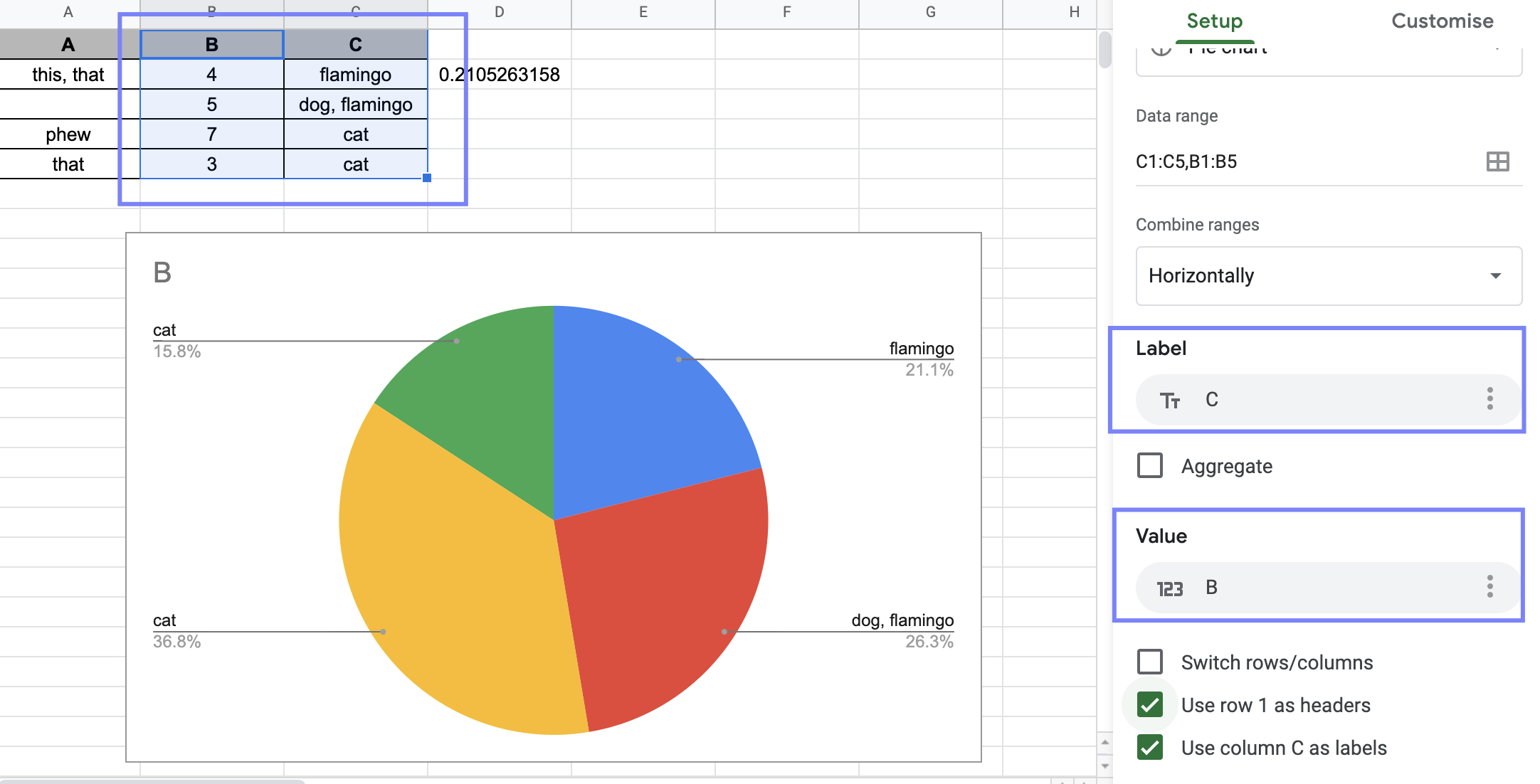
if you select TWO or MORE columns:
- one of the two columns can be the label
- the column left can be value (if select the same column for value as label, your pie chart becomes a one column chart)
as shown on the spreadsheet below:
Since the chart was built using filters, the chart can be then clickable … no idea how to go around this at this time but it should be possible.