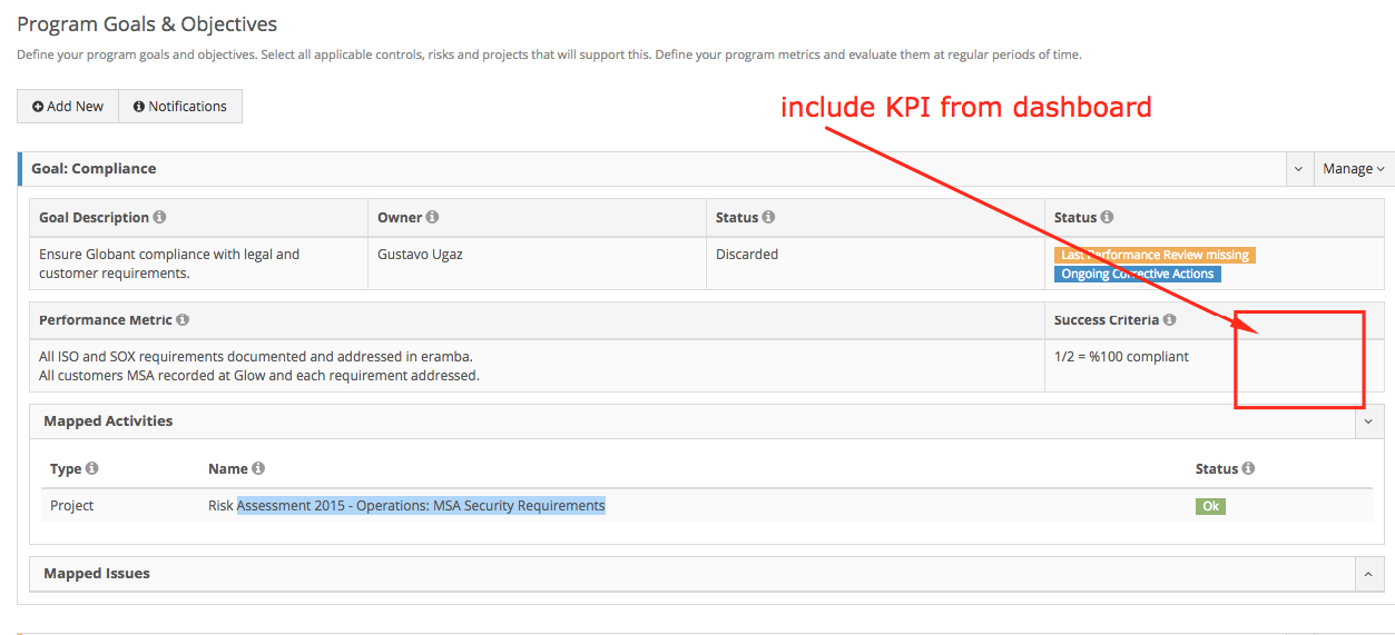
KPI Dashboard
We are replacing our “old” dashboards for something flexible and more useful, we’ll focus on showing KPIs.
In a second phase, we’ll update “Reports” for better graphic libraries that will allow us to do far better job at showing information in “graphical” terms. We like this library for working wiht graphical interfaces: https://d3js.org/
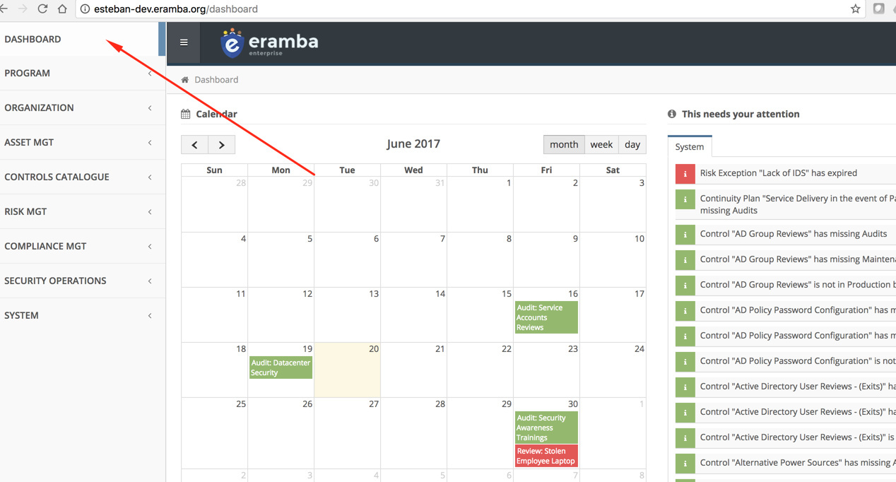
User Dashboard
When the user logs in a personalised set of metrics will be shown to the user based on the role he/she has on each section.
REMBER: “Roles” within each section will be “Customizable” in the future, this means that each section might have in the future more rows than shown here based on what custom fields you will define.

- Numbers will be links to each section that will show the information using filters.
- Coming “cell’s” (actions the user must perform in the future) will show items a “week” from now.
- Numbers will be “stored” every day, because we want to be able to:
- Download this numbers over time (CSV)
- Generate graphs over time
- We want the user to define its own KPI on each section using its “private” filters (not on the first iteration)
- When workflows come to live, this section will also indicate what “Actions” are missing in terms of workflows (not on the first iteration)
- A single PDF will be available for download and also sent by email as an “Awareness” notification.
The list of KPI are kept on this spreadsheet: https://docs.google.com/spreadsheets/d/1pTpLRbgPIzlrJkKGfu1dQmdE8_T25XG1-QW80Kk4ZAI/edit#gid=0
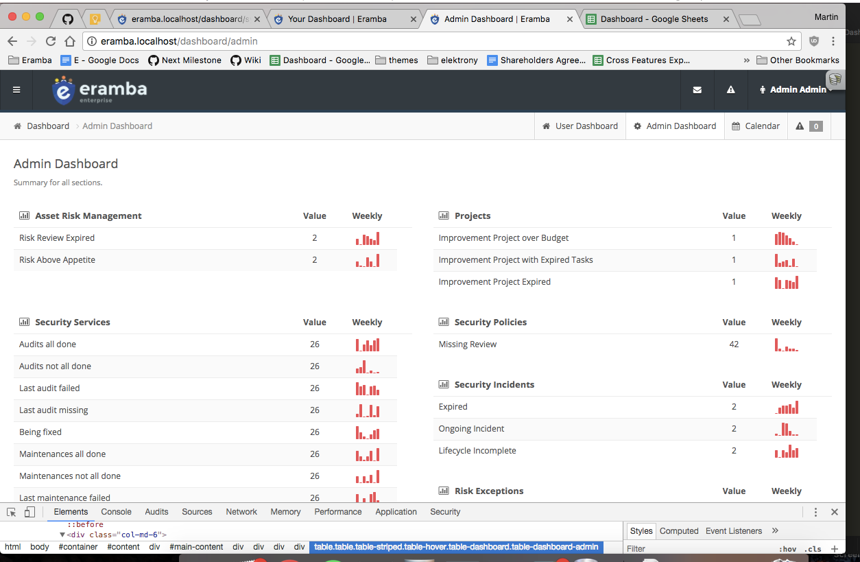
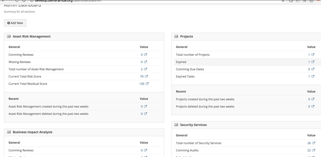
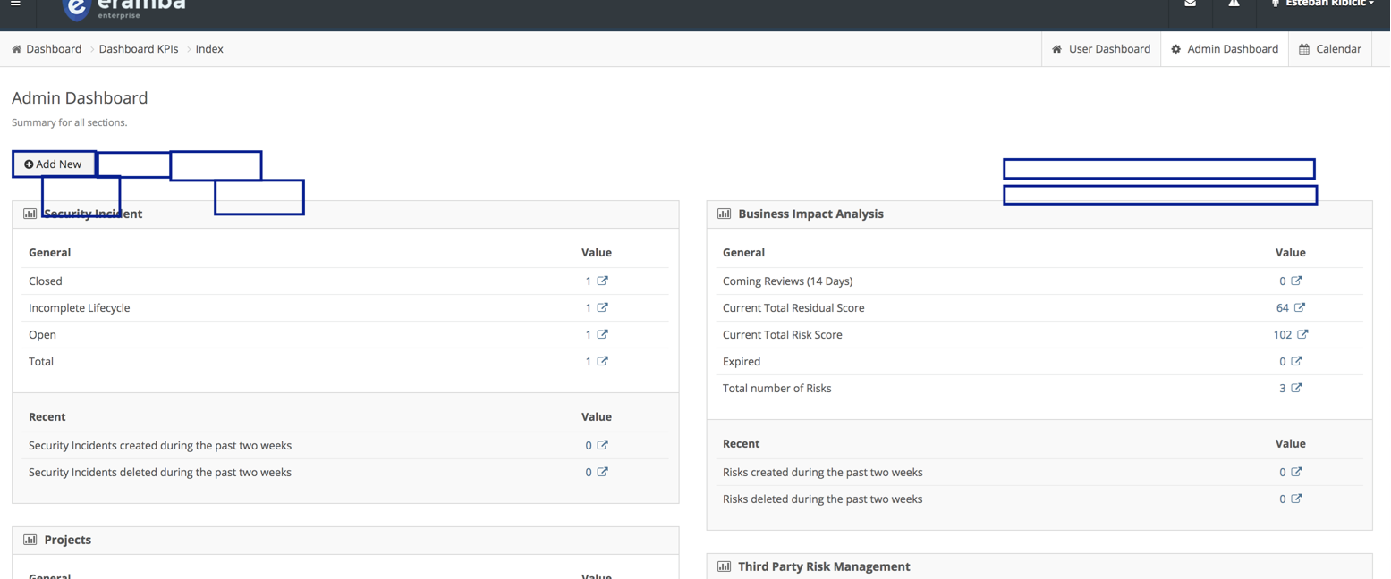
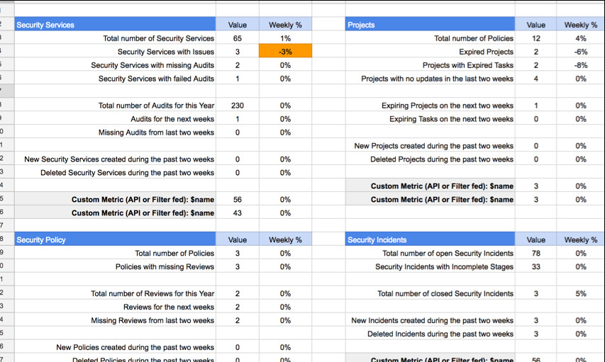
Admin Dashboard
When a user logs into the system, if it is in a special group (system / settings / groups) of people will be shown an “Admin Dashboard”, the difference with the previous dashboard is that this one shows data no matter if the data is related to the logged user or not. This dashboard will be created once we feel confortable with the “User Dashboard”
-
Each “Section” has a predetermined number of metrics, they are the output of:
-
A filter count (the number of results a filter returns)
-
The summatory of a column of a filter (for example a metric that shows the total risk score of the organisation would sum the “Residual Risk” and show it on the KPI)
-
It will be possible to include on each section two dynamic KPIs
-
Existing filters on each respective section
-
API fed metrics (for example, i’ll fed once a day the KPI using a remote REST API call)
-
Numbers will be “stored” every day, because we want to be able to:
-
Download this numbers over time (CSV)
-
Generate graphs over time
-
Thresholds will be possible to define in order to “colour” metrics based on the “weekly” variance.
-
A single PDF will be available for download and also sent by email as an “Awareness” notification.
The full list of KPI for this dashboard is documented on this google spreadsheet: https://docs.google.com/spreadsheets/d/1pTpLRbgPIzlrJkKGfu1dQmdE8_T25XG1-QW80Kk4ZAI/edit#gid=0
Displaying mode
When the user logs in it will be redirected to this dashboard (unless it hit a direct URL) , if the user mets the condition to see one or the another it should somehow be possible to switch from one view to the other.